A vendor wanted $14,994 for six translation devices. We built the same thing as a free webpage in a day. The math, the build, and the question to ask before signing any AI hardware quote.
Read MoreThe $15,000 Quote We Answered with a Webpage
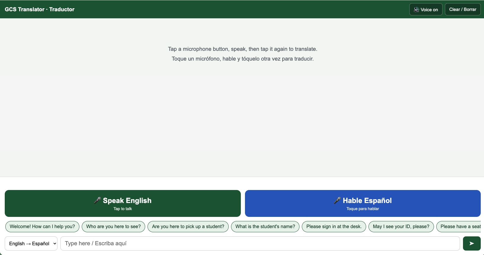

A vendor wanted $14,994 for six translation devices. We built the same thing as a free webpage in a day. The math, the build, and the question to ask before signing any AI hardware quote.
Read MoreI used to be a baseball purist, but I really love the innovations the game has added in the past few years. The pitch clock has made baseball much more enjoyable to watch. Now ABS has added a dimension to the game that holds umpires accountable and allows teams to have some agency in what the strikezone is and should be.
Because I am curious how this is going, I built a dashboard that tracks every ABS challenge of the season and refreshes itself every morning. The team and player numbers come straight from Baseball Savant. The umpire numbers were harder, because Savant does not publish an umpire leaderboard for challenges. So I built that part myself: pull each challenged pitch from the game feed, look up who was behind the plate that day, and tie the two together. About 3,900 challenges across roughly 950 games so far, stitched to the right umpire one game at a time.
The whole thing runs on autopilot through a scheduled job, commits the fresh data, and redeploys. I do not touch it. You can look at it here.
A few things jump out once the data piles up.
League-wide, about 52.8% of challenges get overturned. That is the number I keep coming back to. Half the time the human was right, half the time the robot disagrees. It is a coin flip with a faint lean toward the challenger.
Teams are not equal at it. Detroit is the sharpest in baseball at around 60%, with Texas and Arizona right behind. Pittsburgh is the worst at about 43%, which means the Pirates are mostly challenging pitches the robot was happy to call the way they were called.
Umpires are not equal either. The most-overturned crew chief gets reversed on roughly 72% of his challenged calls. The steadiest umpires sit around 33%, meaning their calls hold up two times out of three. That is a real spread, and it is exactly the kind of thing nobody could measure before this year.
And then there is the position breakdown, which is my favorite. Catchers do about half of all challenging and win most often, near 59%. Hitters are middle of the pack. Pitchers almost never bother, and when they do they are wrong two-thirds of the time. On every single team, the most active challenger is the catcher. The guy who frames pitches for a living turns out to be the best at knowing when the call was wrong. That is not a surprise once you say it out loud, but it is satisfying to see it fall out of the numbers.
Here is the question that actually pulled me in: does being good at the robot game help you win baseball games?
No. Not yet in the numbers we can see. The correlation between a team's challenge success rate and its winning percentage is about negative 0.05, which in plain terms is nothing. Detroit leads the league in challenge accuracy and is sitting around .406.
The challenge system was supposed to settle arguments. It did. It also quietly opened up a brand new one, because now we can rank the umpires, rank the teams, and watch the catchers run the whole operation.
So I am keeping score on the thing that keeps score. It updates every day, in case you want to check whether your team is any good at arguing with a robot.
The bracket model that picked Duke now picks Michigan. The full stacked ensemble says Michigan 66.9%. A late-round specialist model trained only on Elite Eight, Final Four, and championship games says Michigan 78.1%. Ten thousand Monte Carlo simulations were unanimous. The only catch: UConn has already beaten this model’s picks twice.
Read MoreOn March 30, a Senate amendment quietly changed the virtual school closure bill to shift authority from the state to individual LEAs. It wasn't in the bill summary. It wasn't in the newsletter from our advocacy group. It was buried in SA0611, one of 51 amendments I was tracking across 38 bills.
I caught it because I built a system that catches things like that.
Large districts have government relations staff. State associations put out weekly summaries, but they're broad, they lag by a few days, and they don't tell you what a bill means for *your* district. When you're an assistant director at a 2,800-student district, legislative monitoring is something you do between budget meetings and bus route complaints.
During the 2025-2026 Tennessee General Assembly session, I started with the same approach everyone uses: skimming the TSBA updates, reading EdTrust emails, occasionally pulling up a bill on the legislature's website. It worked fine until it didn't. Bills were moving fast. Amendments were changing the substance of what I thought I understood. And I realized I was spending hours each week just trying to stay current, let alone actually analyzing what any of it meant for us.
In early March, I built a Claude Code skill that scrapes the Tennessee General Assembly website, pulls status, votes, amendments, fiscal notes, and sponsors for every bill I'm tracking, then generates a color-coded Excel workbook with six sheets: the main tracker, category breakdown, timeline, full details, amendments, and vote analysis. It rates each bill's impact on our district, flags close votes, and highlights fiscal notes.
The first run pulled 32 bills from a State Affairs Pro report. By April, we were at 38 bills and 53 amendments.
The system runs in parallel, eight bills at a time, fetching directly from wapp.capitol.tn.gov. A full update takes a few minutes. I scheduled automated runs for heavy hearing days using launchd, so updates just showed up in my inbox after evening floor votes.
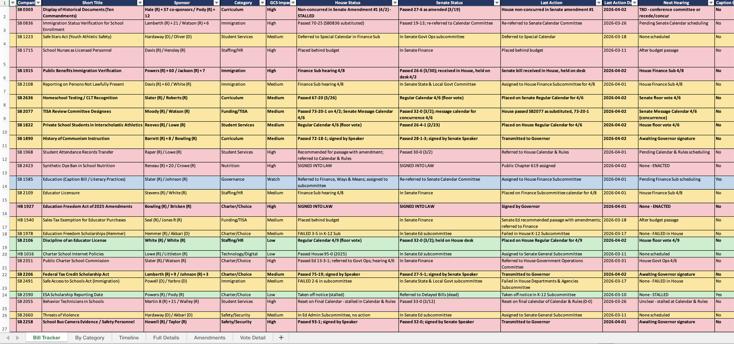
Screenshot of tracker spreadsheet
The tracker isn't interesting because it's automated. It's interesting because it changed what I could do with the information.
When HB 2485 (expanding the TISA economically disadvantaged definition, $83.7M fiscal note) came up for subcommittee, I already had the data I needed. I pulled our enrollment numbers, the gap between our CEP methodology and the TISA classification, and the roughly $800,000 annual funding impact, then sent tailored emails to our representative and senator the same day the alert came in. The tracker had already done the homework. I just had to write the email.
When HB 2393 (K-5 digital device restrictions) passed the House 87-6, I knew immediately that the original prohibition had been softened by amendment SA0607 into a policy-based approach with eight permitted use categories. That distinction matters for how we plan our implementation. Without amendment tracking, I would have read "digital device bill passes" and assumed the worst.
When HB 0793 (immigration enrollment verification) accumulated nine amendments across both chambers, the tracker flagged each one and assessed whether it changed the compliance burden. The headline bill and the bill-as-amended were two very different things.
This is the part I think matters most for anyone considering something similar. The tool didn't start as what it is now. It started as a spreadsheet generator. Then I realized amendments were changing bills substantively, so I added amendment tracking. Then I caught a discrepancy between what the tracker reported and what was actually on the legislature's website, so I built a fact-check mode that runs three parallel verification agents across all 38 bills. Then I got tired of the plain-text email summaries, so I added an HTML email generator with color-coded status badges and hearing schedules that I can forward directly to my leadership team.
Each addition came from hitting a real wall, not from planning features in advance.
I open-sourced the skill on GitHub with the PII scrubbed. It's built for Tennessee's legislature website, but the architecture is the same for any state: fetch bill status from the official source, track amendments, categorize by district impact, generate reports.
The point isn't that every district administrator should learn to build Claude Code skills. The point is that the gap between what large districts can monitor and what small districts can monitor just got a lot smaller. The tools exist. The data is public. The bottleneck was always the human time to pull it all together, and that bottleneck is gone.
Three bills from my tracker are now law. Three more are on the governor's desk. The ESA expansion bill, at $150 million the biggest fiscal item on the tracker, goes to full Finance Committee on Monday. I'll know what happened before I finish my coffee Tuesday morning.
That's not a lobbyist. That's a laptop and a well-built prompt.
The machine learning bracket model went 5-for-8 in the Sweet 16 and 2-for-4 in the Elite Eight. Then Duke’s championship prediction died on Braylon Mullins’ three-pointer with under a second left. The Final Four is set: UConn vs. Illinois, Arizona vs. Michigan.
Read MoreThe model went 33 for 48 through two rounds. Five Round of 32 upsets blew up half the bracket. Here’s what the stacked ensemble says about all eight Sweet 16 games.
Read More"Rhaegar fought valiantly, Rhaegar fought nobly, Rhaegar fought honorably. And Rhaegar died." - George R.R. Martin from A Storm of Swords
That quote has been rattling around in my head all day, because sometimes you do everything right and it still doesn't work out. And when it doesn't work out in front of your entire community, you feel every bit of it.
One of my greatest fears when I decided to apply for Director of Schools in Greeneville was how exposed the whole process would be. Your application is public record. Your interviews happen in front of the board, the staff, the community. People you work with every day are watching. People you go to church with are watching. The parents of the kids in your schools are watching.
There is no quiet rejection letter. No polite phone call. You find out the same way everyone else does, in a room full of people.
I knew this going in. I applied anyway.
When you can't control the outcome, you control what you can. I prepared like my career depended on it, because in some ways it felt like it did. I built data profiles on every school in the district. I studied enrollment trends, assessment data, budget history, staffing patterns. I rehearsed answers until they were sharp and concise. I walked into every round of interviews knowing I had done the work.
And I think it showed. I gave short, direct answers instead of rambling. I spoke from experience, not theory. I was ready.
But preparation doesn't entitle you to anything. It just means you did your part.
In the end, this is a political process. You need 60% of a board to believe you are the right person at the right time. That is three out of five people. You can be qualified, prepared, respected, and still come up one vote short. That is not a reflection of your worth. It is just math.
The person who was selected is a worthy candidate, and I mean that sincerely. I will work hard for him. That is not a line. I have spent my career in service to kids and communities, and that does not change because a vote did not go my way.
People will tell you that failure builds character. I have enough character. What failure actually does is clarify things. It strips away the story you were telling yourself and forces you to look at what is left.
Here is what I know now. I can walk into a room full of people, put myself on the line, and handle the outcome either way. I know that I am good at what I do, not because a board validated it, but because the work I have done over the last two years speaks for itself. And I know that the fear of public failure is worse than the actual thing.
The actual thing just feels like a Tuesday that didn't go your way with a little bit of the five stages of grief sprinkled in.
The Rhaegar quote works because it captures something true: doing everything right does not guarantee the ending you want. Rhaegar was valiant, noble, and honorable. He still lost.
But here is where the analogy breaks down. Rhaegar is dead. I am going to work tomorrow. There are budgets to manage, schools to visit, a salary study to finish, and a hundred other things that matter just as much today as they did last week.
If you are thinking about going for something big and public and risky, do it. Prepare like crazy. Give it your best. And if it does not work out, you will survive. The sun comes up, the work continues, and the people who matter already knew what you were made of before the vote.
"But the wind still blows over Savannah, and in the Spring the turkey buzzard struts and flounces before his hens." - Bukowski, "16-bit Intel 8088 Chip"
A couple of weeks ago, I walked through one of our elementary schools during math block. Half the kids had pencils in hand, working through problems on paper. The other half were on devices, running through adaptive lessons that adjusted in real time to what each student actually knew. It was a balanced, intentional classroom. Nobody was doom-scrolling. Nobody was zoned out. And if the Tennessee legislature gets its way with HB 2393, that second group of kids loses their tools.
HB 2393/SB 2310, sponsored by Rep. Reneau and Sen. Hensley, originally proposed a near-total ban on digital devices for K-5 instruction. The Senate passed an amended version 31-0 on March 16 that softens the language to require policies governing "age-appropriate and instructional use." But the original House version is still alive, and even the amended version creates compliance burdens and chilling effects on technology use that districts like ours would feel immediately.
The bill carves out exemptions for state-required assessments, IDEA/504 accommodations, and targeted intervention. But the exemptions only highlight the contradiction: if devices are good enough for testing and remediation, why are they suddenly dangerous for instruction?
Much of the legislative momentum traces back to Jared Cooney Horvath's "The Digital Delusion," which synthesizes studies to argue that educational technology performs worse than traditional instruction. It's a compelling narrative. It's also built on shaky ground.
Elizabeth Tipton, a Northwestern statistician who is herself skeptical of ed tech, identified serious methodological problems in Horvath's work. His benchmark comparing technology to "ordinary classroom instruction" is, in her words, "wildly unrealistic." The studies he synthesized vary enormously in quality, and technology evolves so fast that findings from even five years ago may not apply to today's tools.
Here's what the research actually shows: it's complicated.
Recreational screen time is bad for academics. That's consistent across studies. Reading on paper still outperforms reading on screens in most contexts. Phone bans produce modest gains, with larger effects for struggling students. But educational technology, used intentionally, is a different category entirely. The American Academy of Pediatrics updated its guidance in January 2026 to eliminate fixed screen time limits altogether, shifting to a quality-over-quantity framework. Interactive, educational screen time is fundamentally different from passive consumption, and the AAP now says so explicitly.
The honest summary: the evidence calls for balance and intentionality, not a blanket ban. Legislators are reading the research selectively and legislating accordingly.
This is where it gets personal. Greeneville City Schools has been doing things electronically for decades. We're a technology-forward district, and we've built that capacity deliberately. If this legislation passes as originally written, the disruption would be enormous.
Adaptive testing platforms like iReady don't just deliver content on a screen. They use item response theory to pinpoint exactly where a student is, what they've mastered, and what they're ready to learn next. A 2018-19 study found that K-5 students using iReady Instruction with fidelity performed statistically better in reading achievement. These aren't worksheets on a screen. They're diagnostic engines that give teachers actionable data they can't get any other way.
Then there's the testing problem. Tennessee tests students on electronic devices. If K-5 students spend years without touching a device for academic purposes, they'll sit down for state assessments with zero familiarity with the testing environment. That's not a level playing field. That's a setup.
And the cost. We've invested in devices, infrastructure, digital curriculum, and training. Ripping that out and replacing it with physical textbooks and paper-based alternatives would be expensive and wasteful. At a time when districts are already stretched thin, the legislature is essentially asking us to throw away working systems and buy new ones.
Here's what frustrates me most: we already have the balance right. Walk through our schools and you'll see as many pencils wagging as screens lit up. Our teachers make intentional choices about when technology serves learning and when it doesn't. We don't need Nashville to make those decisions for us.
There's also something worth naming about affect. Students engage differently with adaptive platforms. Some kids who struggle with traditional instruction come alive when they're working through a well-designed digital lesson. That engagement matters, and it's hard to quantify in a legislative hearing.
Sixteen states are now considering similar bills. The political incentive is obvious: screens are an easy villain, and "protect the children" is an unassailable bumper sticker. But good policy requires nuance, and a one-size-fits-all ban is the opposite of nuance.
Trust your districts. We're the ones in the buildings every day, watching what works and what doesn't. We've read the research too, and we've done the harder work of actually applying it. If the legislature wants to set guardrails around recreational screen time or social media access, fine. We're already there. But don't take away the instructional tools that are helping our students learn, and then turn around and test them on devices anyway.
I built a stacked ensemble to fill out my NCAA bracket. It crushed the chalk and missed every upset. Here’s the scorecard.
Read MoreEvery March, I fill out a bracket with the same strategy: gut feeling, a vague memory of who looked good in February, and the unshakeable belief that this is finally the year a 16-seed makes a deep run. It never works. So this year I tried something different. I built a machine learning model to do it for me, borrowing heavily from the people who do this for real using Claude Code, of course.
Standing on Kaggle's Shoulders
The approach here isn't original. Kaggle runs the March Machine Learning Mania competition every year, challenging data scientists to predict tournament outcomes. I built my model on the foundation laid by Jared Cross's 1st place solution from the 2024 competition, along with the Nate Silver/538 methodology (power rating differential divided by 11, normal CDF) as a sanity check baseline. The competition datasets and the winning approaches are all public, which is what makes a project like this possible for someone who runs a school district by day and trains models by night.
The Data
I pulled 66 datasets covering 18 years of NCAA tournament history. KenPom efficiency ratings, Barttorvik metrics, team resumes, ELO rankings, quad records, shooting splits, coaching histories, conference stats. If someone tracks it, I downloaded it.
From those raw numbers, the model extracts 45+ features for every team: adjusted offensive and defensive efficiency, Dean Oliver's four factors (effective field goal percentage, turnover rate, offensive rebound rate, free throw rate), shooting versatility, defensive pressure, talent ratings, experience, even average height. Then it engineers 10 composite features on top of that, things like quality win percentage and ball security scores.
For every historical tournament game since 2008, the model computes the difference in each of those features between the two teams. That's the training data: 1,070 games where we know who won and by how much.
The Model
A single algorithm wasn't going to cut it. The final model is a stacked ensemble, four base classifiers (logistic regression, gradient boosting, random forest, and histogram gradient boosting) feeding into a meta-learner that weighs their predictions. Think of it as a committee of statisticians who each see the data differently, with a fifth statistician deciding who to trust on any given matchup.
The model hit 73.6% accuracy on a held-out test set. For context, picking the higher seed every game gets you roughly 65%. So the model is finding real signal in the efficiency data beyond what seed lines already tell you.
The single most predictive feature? Barttorvik's adjusted efficiency margin, and it wasn't close. That metric alone carried nearly twice the weight of the next most important feature. Wins Above Bubble, defensive four factors, and assist rate rounded out the top five. Seed difference, the thing most casual bracket-pickers anchor on, mattered less than you'd think.
The Bracket
Once trained, the model does two things. First, it picks a deterministic bracket: for every possible matchup, it takes the team with the higher win probability. Second, it runs 10,000 Monte Carlo simulations, randomly sampling outcomes based on those probabilities, to generate championship odds for every team.
The results:
- Duke: 25%
- Michigan: 18.6%
- Houston: 13.6%
- Arizona: 12.5%
- Purdue: 7.6%
- Illinois: 5.2%
Tennessee, for what it's worth, comes in at 0.2%. I'm choosing to interpret that as "mathematically possible."
The Technical Detour
Here's the part they don't mention in the tutorials. I built this whole thing locally, 1,254 lines of Python, and it wouldn't run. My M3 Max locked up trying to fit the stacked ensemble. This is the second time in two days a machine learning project has tried to kill my laptop (the TN school letter grades analysis did the same thing with XGBoost hyperparameter tuning).
The fix was simple: upload everything to Google Drive and run it in Colab. Free cloud compute, all the sklearn dependencies pre-installed, no kernel panics. The whole pipeline, data loading, training, 10,000 bracket simulations, HTML generation, ran in a couple of minutes.
If you're doing ML work on a Mac and things start freezing, don't fight it. Just move to Colab. Your laptop will thank you.
What I Actually Learned
The model confirmed something I already suspected: efficiency margins are the whole game. Not record, not conference strength, not recruiting rankings. How many points you score per possession versus how many you allow. That's it. Everything else is noise or a downstream effect of that core metric.
It also reminded me that 73.6% accuracy means the model is wrong more than one game in four. March Madness is chaotic by design. Single-elimination tournaments reward variance, and no amount of feature engineering will predict the kid who hits a half-court buzzer-beater.
But that's the fun of it. The model gives you a framework, a set of informed probabilities. What you do with those probabilities is still up to you. The full code, data, and a live tracker comparing predictions to actual results are on https://github.com/jasonbhorne/march-madness-2026.
You can see how it’s doing below.
A machine learning analysis of roughly 1,700 Tennessee public schools across two years, comparing what letter grades tell us versus what they hide.
Tennessee gives every public school a letter grade. A through F, just like report cards. The state calculates it from a formula that weighs achievement scores, growth, chronic absenteeism, English learner progress, and for high schools, graduation rates and college/career readiness.
The formula is public. If you know a school's test scores, you can basically calculate the grade yourself. Which raises a question I've been chewing on: what if you strip out all the test-based inputs and just look at the structural stuff, the demographics, staffing, funding, discipline rates, the conditions a school operates under? How much can you predict?
The answer surprised me.
I pulled every publicly available dataset from the Tennessee Department of Education for the 2022-23 and 2023-24 school years: letter grades, school profiles, chronic absenteeism, discipline, educator experience, teacher retention, staffing ratios, per-pupil expenditures, funding sources, graduation rates, and dropout rates. Merged them all at the school level. About 1,690 eligible schools per year, observed across both years for 3,381 school-year observations.
Then I deliberately removed every variable that directly feeds Tennessee's letter grade formula. No achievement scores, no growth scores, no success rates, no CCR rates. What remained were 33 contextual features: things like percent economically disadvantaged, chronic absenteeism, teacher retention, per-pupil spending, and demographic composition.
I ran the analysis two ways. First, I tried to classify the letter grade itself (A through F). Then I switched the target to overall success rate, the continuous achievement percentage that drives the letter grade. Same features, different targets. The comparison is telling.
Five models. Random Forest, XGBoost, Gradient Boosting, Logistic Regression, and an Ordinal Logistic model that respects the A > B > C > D > F ordering. Best accuracy across the board: about 40%.
| Model | Accuracy | CV Accuracy | Mean Absolute Error |
|---|---|---|---|
| Logistic Regression | 41.8% | 39.9% | 0.73 grades |
| Ordinal Logistic | 41.4% | 40.1% | 0.74 grades |
| Random Forest | 40.2% | 40.3% | 0.75 grades |
| XGBoost | 34.4% | 40.6% | 0.83 grades |
| Gradient Boosting | 37.1% | 39.6% | 0.79 grades |
40% accuracy across five categories is better than random (20%), but not great. The models were off by about 0.75 letter grades on average. If a school is a C, the model might guess B or D. Close, but noisy.
The letter grade bins are doing real damage here. A school with a 49% success rate and a school with a 51% success rate might land in different grade buckets, but structurally they're nearly identical. The model sees the same features and reasonably groups them together, but the grading system draws an arbitrary line between them.
Same 33 contextual features. Same schools. But instead of predicting A/B/C/D/F, I targeted the overall success rate, a continuous percentage from 5% to 95%.
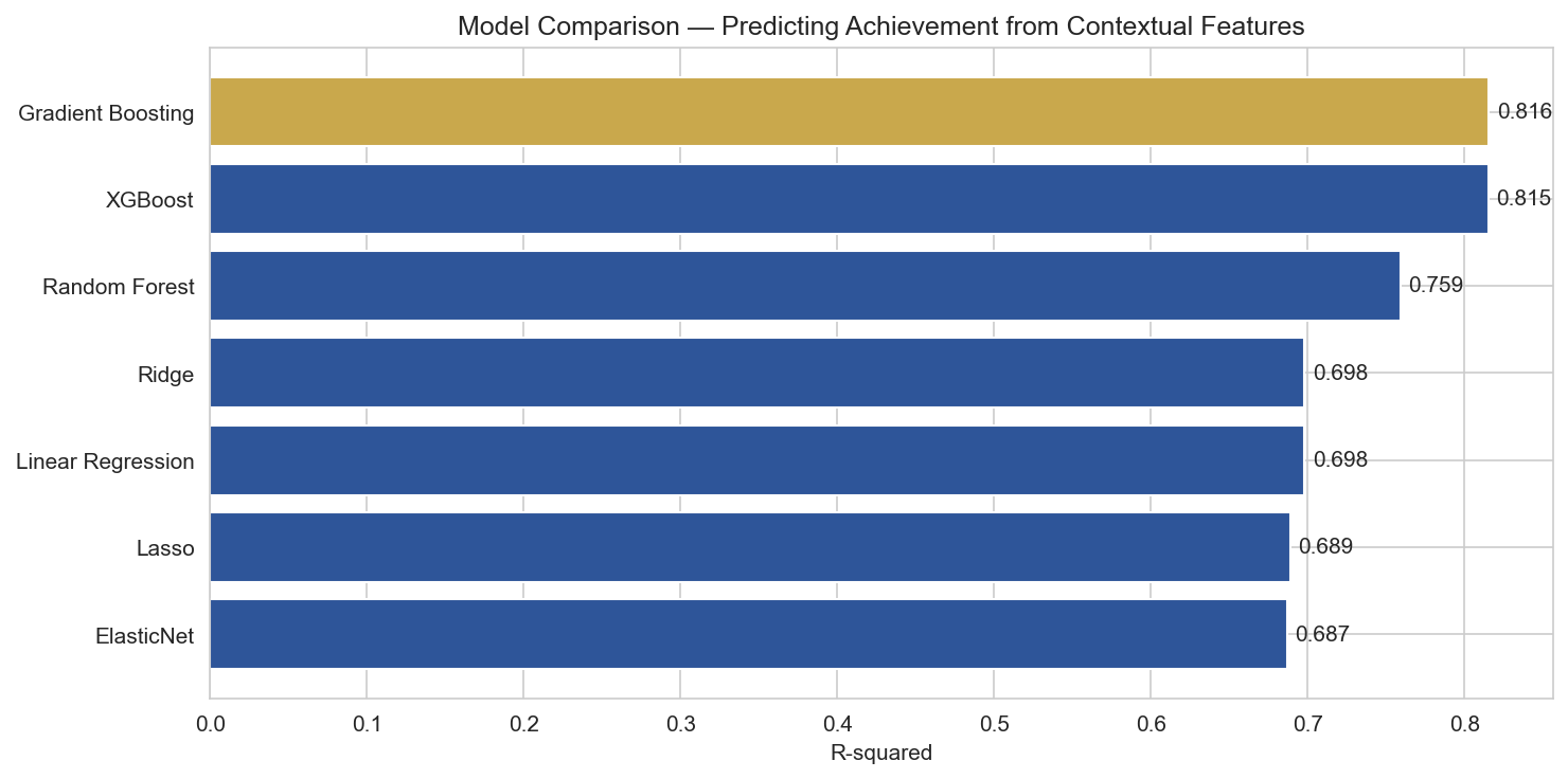
R-squared comparison across models. Gradient Boosting and XGBoost both explain over 81% of variance in achievement.
| Model | R-squared | Mean Absolute Error | CV R-squared |
|---|---|---|---|
| XGBoost (Tuned) | 0.823 | 5.5 pct pts | — |
| Gradient Boosting | 0.816 | 5.6 pct pts | 0.819 |
| XGBoost | 0.815 | 5.7 pct pts | 0.822 |
| Random Forest | 0.759 | 6.4 pct pts | 0.783 |
| Ridge Regression | 0.698 | 7.2 pct pts | 0.663 |
| Linear Regression | 0.698 | 7.2 pct pts | 0.615 |
| Lasso | 0.689 | 7.3 pct pts | 0.661 |
That is a massive jump. The same features that could only guess a letter grade 40% of the time can explain 82% of the variance in achievement when you let the model see the actual number instead of a bucketed label.
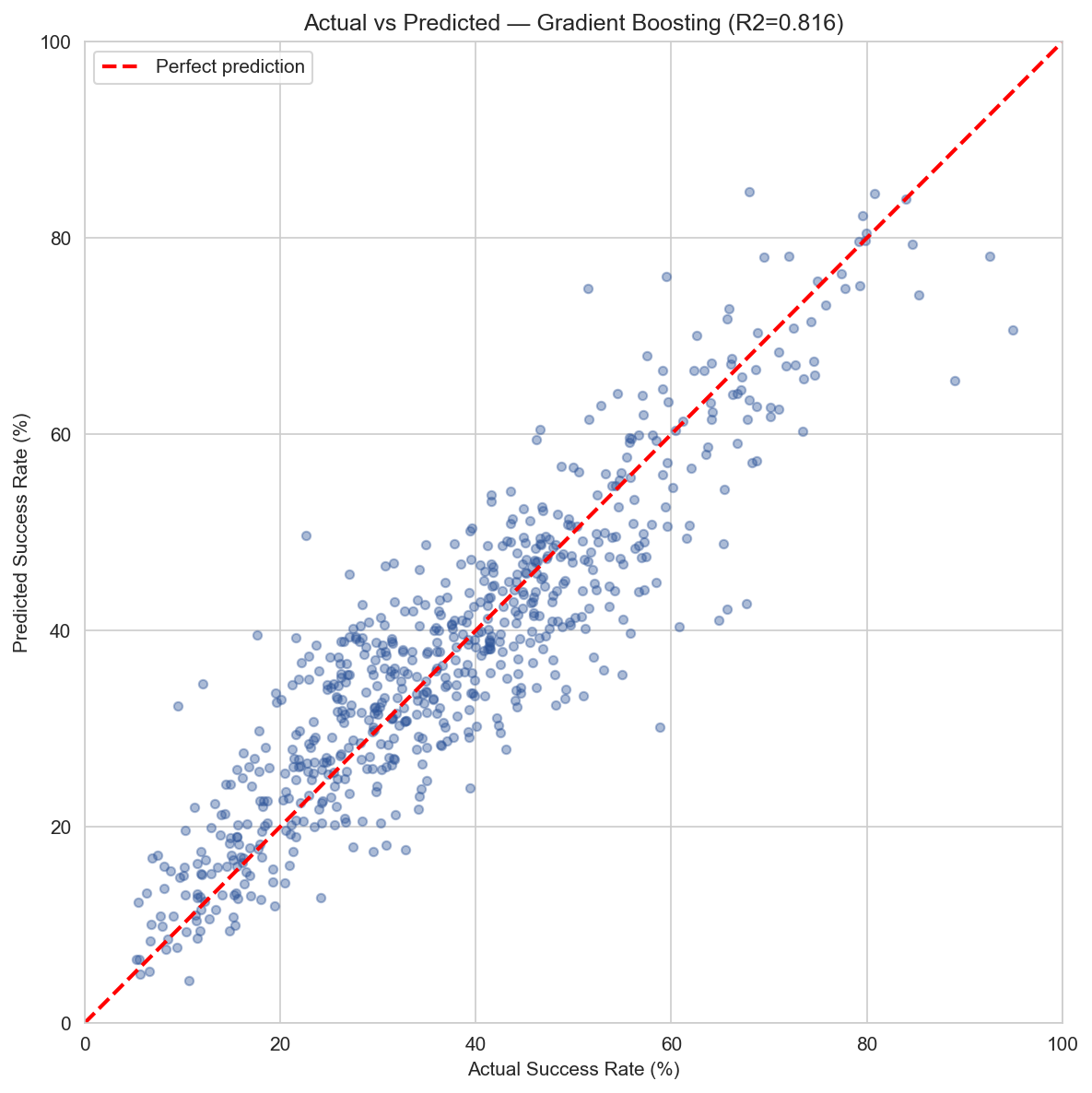
Actual vs. predicted achievement. Points cluster around the diagonal, with an MAE of about 5.5 percentage points.
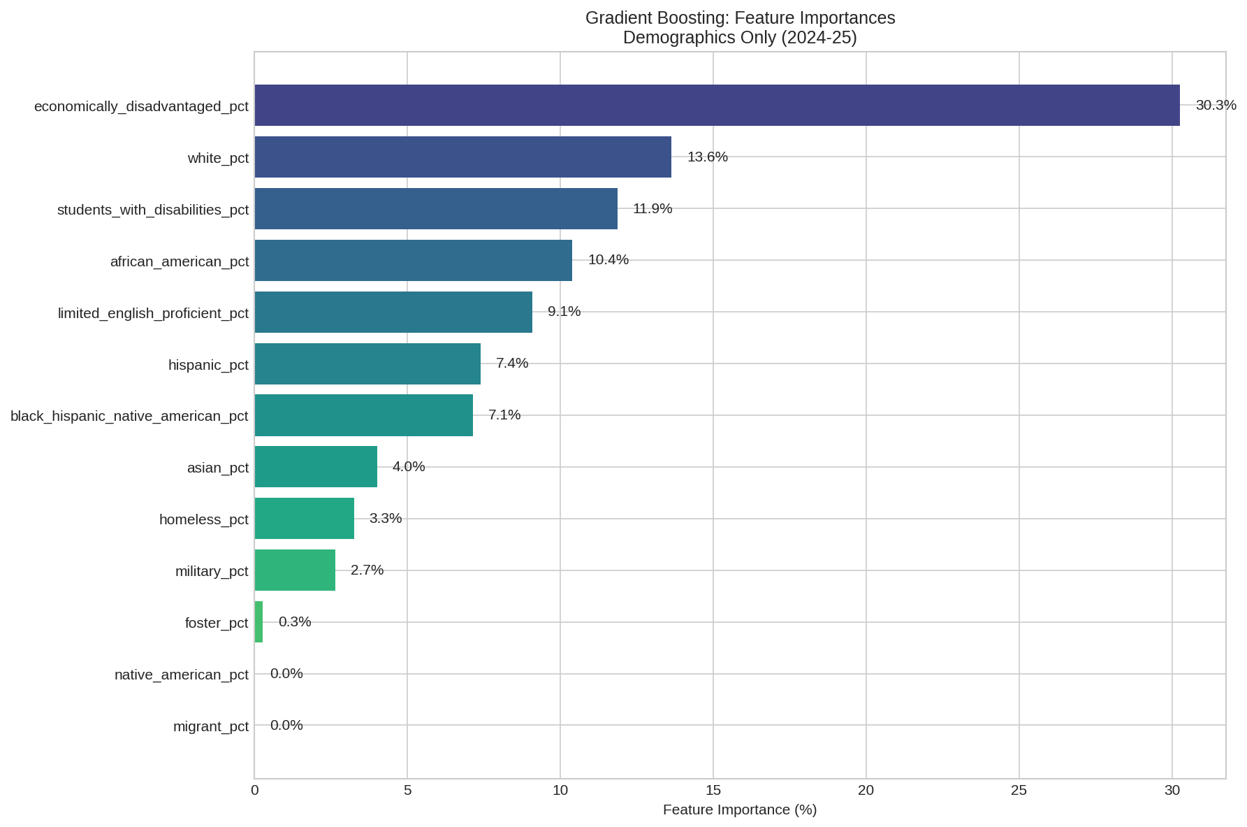
SHAP (SHapley Additive exPlanations) tells us not just which features matter, but how much they move the needle and in which direction. The units here are percentage points of achievement.

Feature importance measured by mean absolute SHAP value. Two features dominate everything else.
Two features tower over the rest:
After those two, a cluster of second-tier features emerges: local funding percentage (positive), demographic composition, experienced teachers (positive), teacher retention (positive), and discipline rates (negative). Each of these contributes roughly 0.6 to 1.3 percentage points.
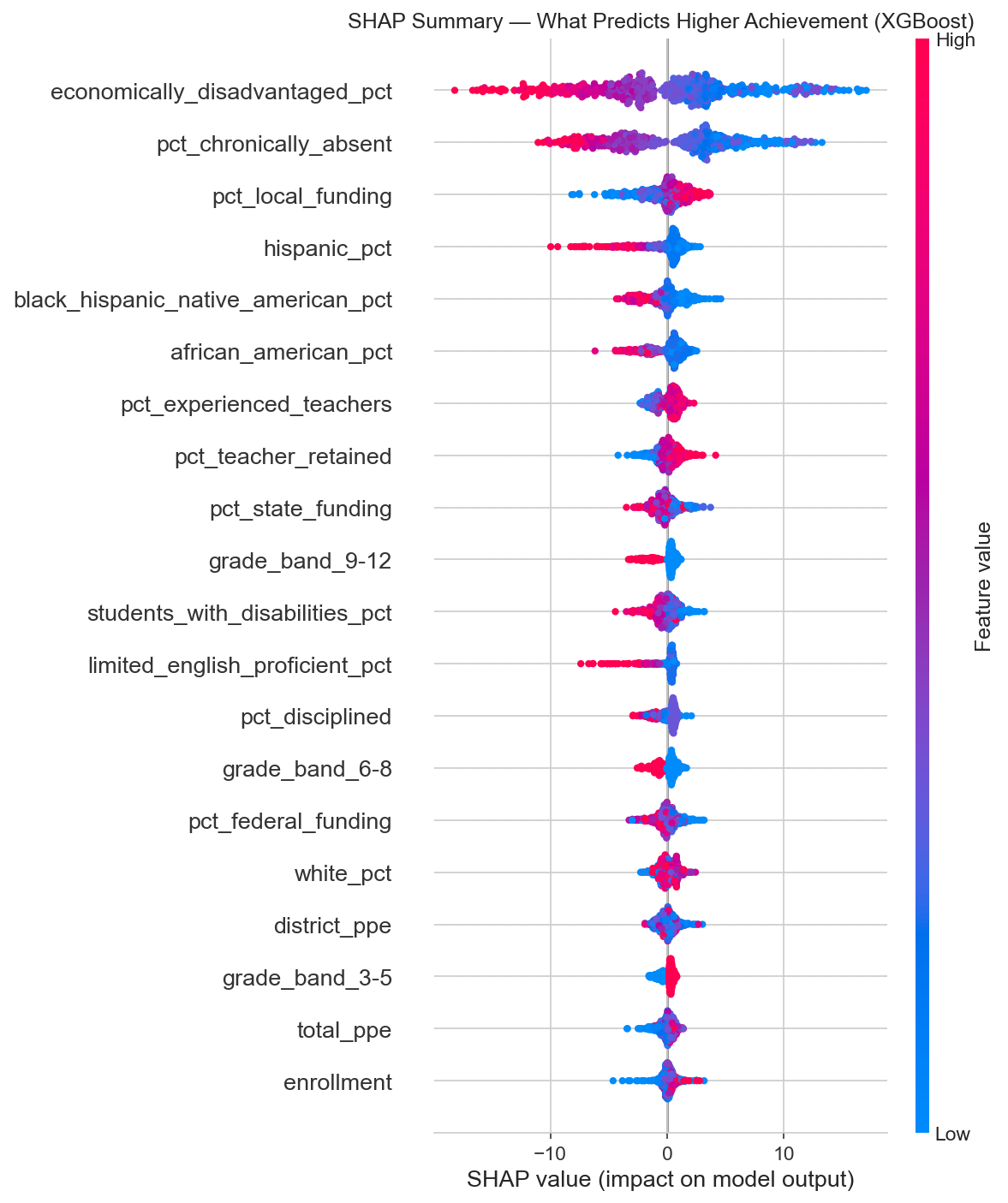
SHAP beeswarm plot. Each dot is one school. Red means high feature value, blue means low. Dots pushed right increase the predicted success rate, dots pushed left decrease it.
Look at that SHAP summary. High economically disadvantaged percentage (red dots) consistently pushes predictions left (lower achievement). High chronic absenteeism does the same. High local funding and experienced teacher percentages push right (higher achievement). The patterns are clear and consistent.
The letter grade classification flopped not because the features lack signal, but because the grading system collapses a continuous reality into five bins. A school at the 49th percentile and a school at the 51st percentile might be structurally identical, but one gets a C and the other a B. The model can't distinguish them because there's nothing structurally distinguishing to find.
When you let the model predict the actual achievement percentage, it stops fighting artificial boundaries and starts learning the real relationship between conditions and outcomes. The same data that produced a mediocre 40% classifier produces an R-squared of 0.82 when you ask the right question.
This is a data science lesson wrapped in education policy. If your outcome variable is discretized from something continuous, you're throwing away information. The letter grade system takes a rich, nuanced distribution of achievement and flattens it into a handful of buckets.
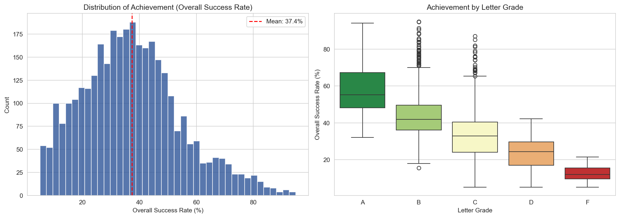
Left: the actual distribution of achievement across Tennessee schools. Right: the same data, grouped by letter grade. Notice the overlap, especially between B, C, and D schools.
I work for Greeneville City Schools, so I ran our numbers through the same lens. The model says poverty and absenteeism explain 82% of achievement. GCS has a district-wide economically disadvantaged rate around 29%, which puts us in the middle of the pack. Based on structural factors alone, the model would predict us to land somewhere around the state average.
We don't.
In 2023-24, four of our seven schools earned A grades. Here's every GCS school, year over year:
| School | ED % | 2022-23 | 2023-24 | Change |
|---|---|---|---|---|
| Eastview Elementary | 18% | 56.9% (A) | 61.2% (A) | +4.3 pts |
| Tusculum View Elementary | 27% | 41.8% (B) | 50.0% (A) | +8.2 pts |
| Greeneville High School | 24% | 50.0% (A) | 48.4% (A) | -1.6 pts |
| Greeneville Middle School | 24% | 44.9% (B) | 47.8% (A) | +2.9 pts |
| Hal Henard Elementary | 36% | 49.7% (B) | 48.3% (C) | -1.4 pts |
| Highland Elementary | 54% | 32.6% (C) | 36.5% (C) | +3.9 pts |
| TOPS Greeneville | 17% | 29.1% (D) | 37.5% (C) | +8.4 pts |
Five of seven schools improved, several significantly. Tusculum View jumped from a B to an A with an 8.2-point gain. TOPS Greeneville climbed 8.4 points and moved from a D to a C. Even Highland Elementary, our highest-poverty school at 54% ED, scored 36.5%, well above the 24% state average for schools in that ED range. Highland ranks 13th out of 131 schools with similar poverty levels statewide.
The model says schools like ours should perform at a certain level given our demographics. We keep outperforming that prediction, and the gap is widening. That's not an accident. That's what happens when experienced teachers stay (we have strong retention), absenteeism is managed, and the district invests in the things that actually move the needle.
If you run a school district in Tennessee, here is what 1,700 schools, two years of data, and seven models are telling you:
None of this is new to anyone who runs schools. We all know poverty predicts outcomes. But there's a difference between knowing it and seeing a machine learning model explain 82% of the variance with nothing but contextual features. It puts a precise number on something we've felt in our bones for years.
The uncomfortable implication: Tennessee's letter grade system is, to a large degree, grading the ZIP code. A school's structural context is doing most of the talking, and the letter grade is mostly just a noisy echo of it. But districts like Greeneville show it doesn't have to be destiny. The 18% of variance the model can't explain? That's where the work happens.
Data: Tennessee Department of Education public data downloads for 2022-23 and 2023-24. All school-level. Schools flagged as ineligible for letter grades were excluded. Approximately 1,690 unique schools observed across both years, yielding 3,381 school-year observations (3,345 with valid achievement data).
Features: 33 contextual variables across demographics, teacher quality, discipline, absenteeism, finance, staffing, graduation, and dropout. All formula-input features (achievement scores, growth scores, success rates, CCR rates) were deliberately excluded.
Models: Seven regression models (Linear, Ridge, Lasso, ElasticNet, Random Forest, Gradient Boosting, XGBoost) plus hyperparameter tuning via RandomizedSearchCV. Five classification models for the letter grade comparison. 80/20 train/test split, stratified. 5-fold cross-validation on training sets.
SHAP values computed via TreeExplainer on the XGBoost regression model. All code available on request.
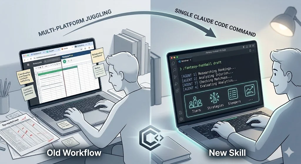
I built a Claude Code skill that replaces a messy multi-AI fantasy football workflow — draft prep, live drafting, weekly matchups, and trade analysis — all from a single command.
Read MoreAI slop is showing up in school newsletters, company emails, and public communications everywhere. Learn how to recognize it and five best practices for using AI as a tool without losing your voice.
Read MoreCan student demographics alone predict a school's letter grade? Using machine learning algorithms like Gradient Boosting and K-means clustering, this analysis explores the deep (but not deterministic) link between poverty, diversity, and Tennessee's latest accountability scores.
Read MoreThe Tennessee Department of Education released the 2024-25 school letter grades on December 18, 2024. This is the third year of letter grades under the revamped formula that emphasizes academic achievement over growth. In this post, I continue my analysis of these letter grades, examining distribution trends, demographic correlations, and standout schools.
The data files used for this analysis are available from the Tennessee Department of Education's data downloads page. I merged the 2024-25 Letter Grade File with the 2024-25 School Profile data to examine demographic patterns.
Out of 1,905 schools listed for letter grades, 208 (10.9%) were ineligible to receive a grade. These schools were excluded from this analysis, leaving 1,697 eligible schools.
The 2024-25 letter grades were distributed as follows:
A: 355 (20.9%)
B: 483 (28.5%)
C: 491 (28.9%)
D: 302 (17.8%)
F: 66 (3.9%)
This continues the positive trend we've seen over the past three years. The percentage of A schools has increased from 17.4% in 2022-23 to 20.9% in 2024-25, while F schools have decreased from 5.4% to 3.9%.
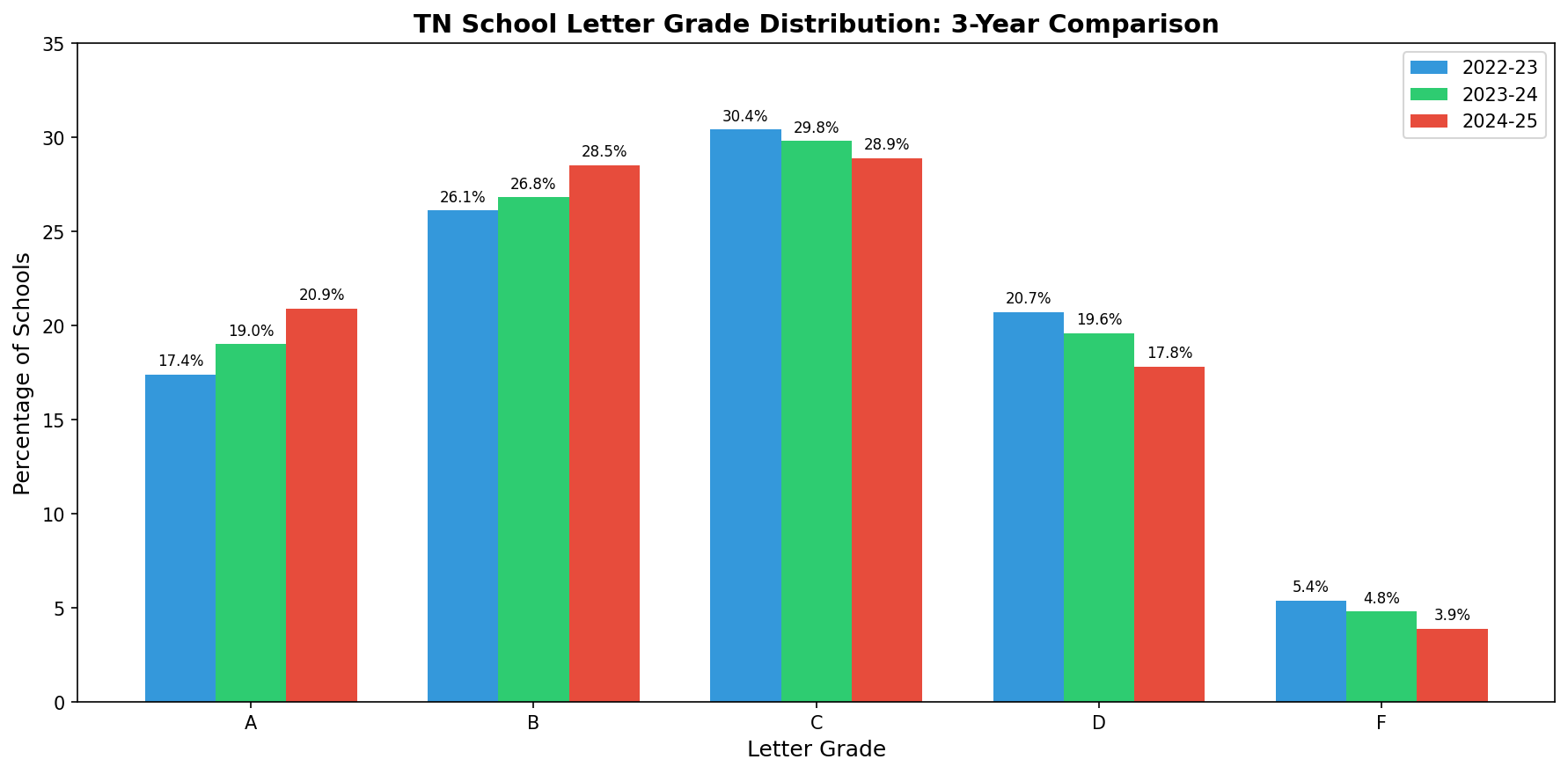
Distribution Comparison
| Grade | 2022-23 | 2023-24 | 2024-25 | 3-Year Change |
|---|---|---|---|---|
| A | 17.4% | 19.0% | 20.9% | +3.5% |
| B | 26.1% | 26.8% | 28.5% | +2.4% |
| C | 30.4% | 29.8% | 28.9% | -1.5% |
| D | 20.7% | 19.6% | 17.8% | -2.9% |
| F | 5.4% | 4.8% | 3.9% | -1.5% |
The data shows steady improvement: more schools are earning A's and B's while fewer are receiving D's and F's.
| Grade | Achievement | Growth | Growth25 | Success Rate | LG Score |
|---|---|---|---|---|---|
| A | 4.85 | 4.94 | 4.29 | 58.2% | 4.83 |
| B | 4.06 | 3.78 | 3.47 | 44.5% | 3.91 |
| C | 3.21 | 2.52 | 2.91 | 35.4% | 2.94 |
| D | 2.08 | 1.61 | 2.71 | 23.7% | 2.01 |
| F | 1.00 | 1.00 | 2.90 | 12.5% | 1.18 |
A notable pattern persists from previous years: schools with an F grade actually show higher Growth25 scores (2.90) than D schools (2.71). This metric measures the progress of the lowest-performing 25% of students. While F schools are making gains with their struggling students, this improvement is not sufficiently weighted to improve their overall letter grade.
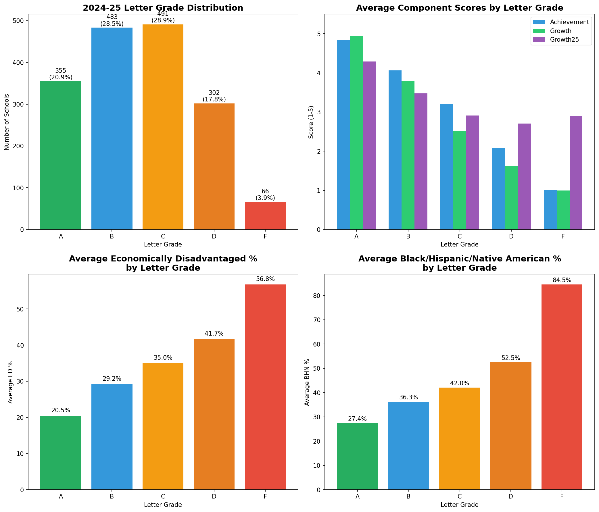
Summary Dashboard
The relationship between demographic factors and letter grades remains significant.
| Grade | 2022-23 | 2023-24 | 2024-25 |
|---|---|---|---|
| A | 18.3% | 22.3% | 20.5% |
| B | 28.9% | 31.1% | 29.2% |
| C | 36.5% | 38.9% | 35.0% |
| D | 42.0% | 45.9% | 41.7% |
| F | 54.5% | 49.6% | 56.8% |
| Grade | 2022-23 | 2023-24 | 2024-25 |
|---|---|---|---|
| A | 21.8% | 35.8% | 27.4% |
| B | 27.7% | 48.7% | 36.3% |
| C | 39.5% | 56.0% | 42.0% |
| D | 55.0% | 65.8% | 52.5% |
| F | 80.1% | 82.2% | 84.5% |
The gap between A schools and F schools remains substantial. A schools average 20.5% economically disadvantaged students compared to 56.8% in F schools. For BHN students, the gap is even more pronounced: 27.4% in A schools versus 84.5% in F schools.
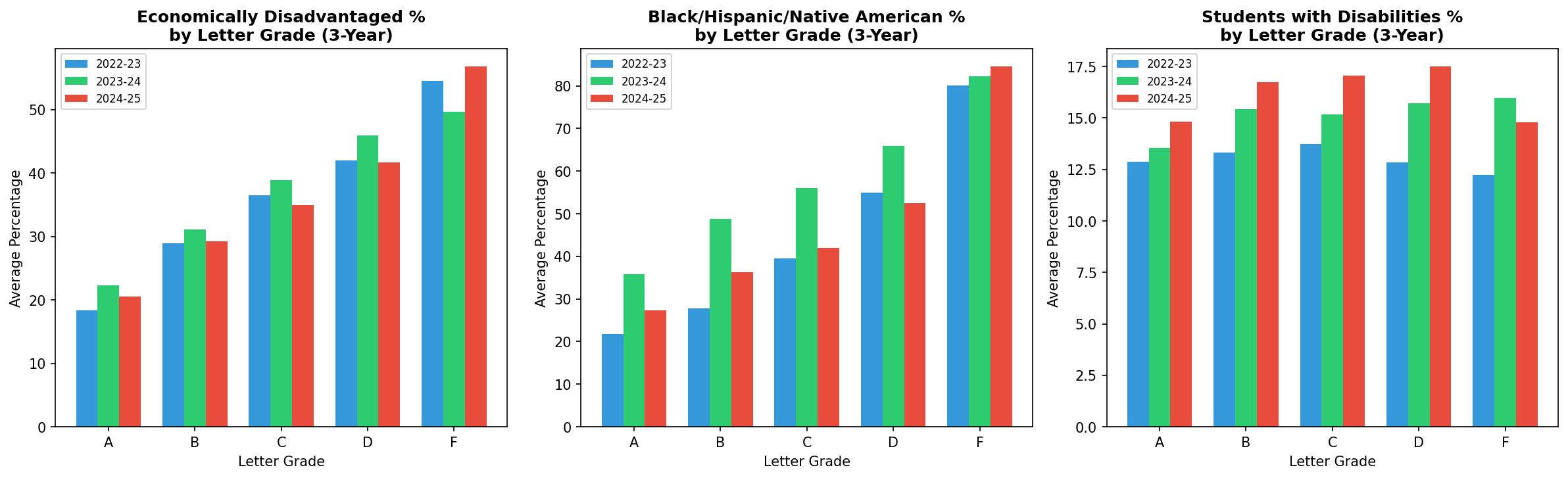
Subgroup Three-Year Comparison
The correlations between demographic factors and letter grade scores show a consistent pattern across all three years:
| Subgroup | 2022-23 | 2023-24 | 2024-25 |
|---|---|---|---|
| Economically Disadvantaged | -0.50 | -0.44 | -0.47 |
| Black/Hispanic/Native American | -0.37 | -0.39 | -0.34 |
| Students with Disabilities | -0.09 | -0.13 | -0.12 |
The correlation between economically disadvantaged percentage and letter grade score (r = -0.47) indicates a moderate negative relationship. Schools with higher percentages of economically disadvantaged students tend to receive lower letter grades.
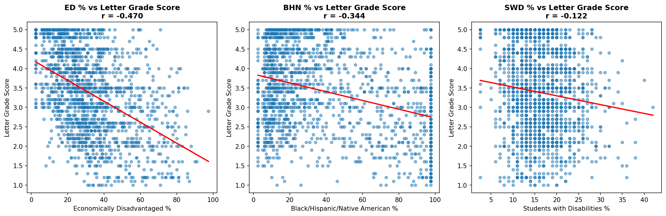
Correlation Scatterplots
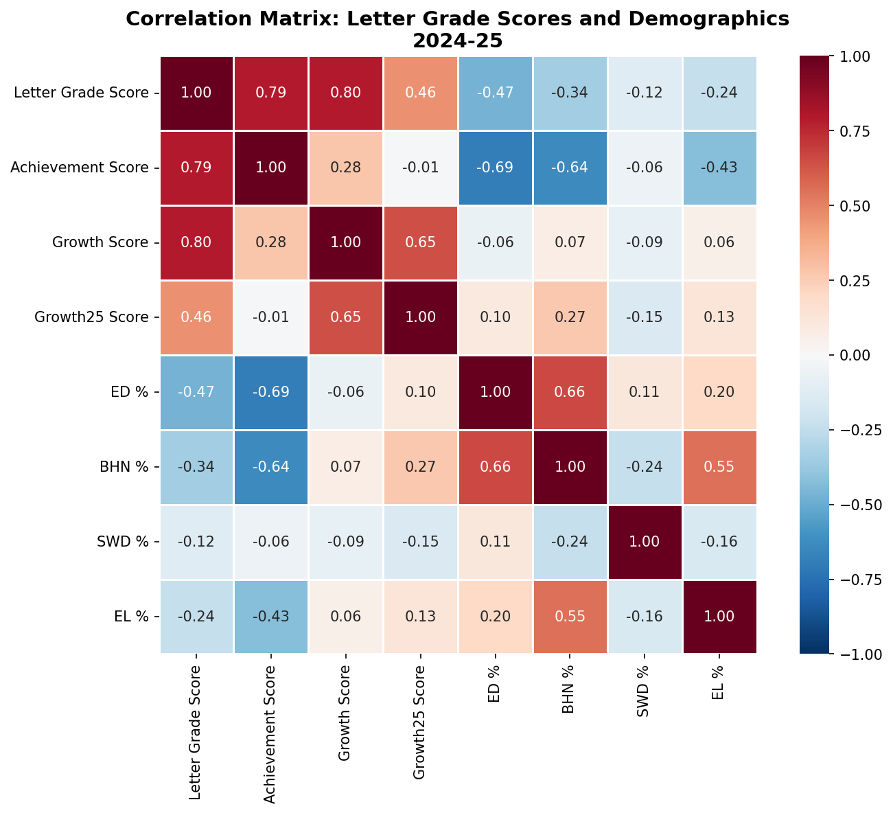
Correlation Heatmap
The 2024-25 letter grades show continued improvement across Tennessee schools. Key findings include:
1. More schools are earning A's (20.9%, up from 17.4% three years ago) and fewer are receiving F's (3.9%, down from 5.4%).
2. The correlation between poverty and letter grades remains strong (r = -0.47), but some high-poverty schools continue to beat the odds.
3. F schools continue to show strong Growth25 scores, meaning they are making progress with their lowest-performing students, but this is not reflected in their overall grades.
The letter grade system continues to simplify complex accountability measures into easily digestible grades. While this provides transparency for families and communities, it's important to remember that these grades are heavily influenced by factors outside of schools' direct control, including poverty and segregation. Schools serving high-need populations face steeper challenges in achieving high letter grades, making the success of many schools all the more remarkable.
Also, it is important to note that many schools in Northeast TN (Johnson, Carter, Unicoi, Greene, and Washington Counties) went through major flooding in the fall, and they worked very hard to just have school, much less show improvement in accountability data.
This analysis used Python with pandas, matplotlib, seaborn, and scipy for data processing and visualization. I used Claude to do the coding and proof my writing.
Dear Members of the Board:
When I was in college at ETSU, I had the chance to study in Paris twice. We stayed at the Cité Universitaire, a community built after World War I so students from around the world could live and learn together. The purpose was simple: understanding. That, at its core, is what studying a world language gives our students.
Learning another language opens doors. Even the basic knowledge gained in high school helps students communicate, connect, and participate more confidently in a global economy. If our goal is to prepare young people for the future, giving them at least an introduction to another language seems essential.
It also expands their understanding of people beyond our borders. Many of our students may never travel internationally, but world language classes give them access to other cultures, traditions, and ways of thinking. These courses build cultural awareness, empathy, and curiosity: qualities that strengthen citizenship at home. These are qualities we hope to see in the citizens of Tennessee.
Mark Twain once said that travel is “fatal to prejudice, bigotry, and narrow-mindedness.” The study of world languages offers a similar antidote. It broadens young people’s perspectives and helps them see the world, and others, with clearer eyes.
Please do not eliminate world languages as a graduation credit. Tennessee already provides flexibility for students who wish to pursue an additional program of study in place of World Languages and Fine Arts. There is no compelling reason to remove this requirement entirely, and doing so would limit the opportunities we give our students.
Finally, consider what unintended consequences this would have on World Language programs in small, rural counties. Large metropolitan districts could absorb the cost of this, but schools on smaller budgets would have to consider eliminating these programs altogether.
Thank you for your consideration.
Jason B. Horne, Ed.D.
French Teacher
Assistant Director of Schools, Greeneville City Schools
You can find my TASBO presentation here.
When researching fantasy football strategies, you’ll notice that they almost all say the same thing: draft Ja’Marr Chase or Justin Jefferson in the first round. Beyond that, it gets a little hazy. Some say to go heavy with WRs and some say to go heavy with RBs, and some say don’t even look at a RB or QB until the 5th round. Sifting through all of this great advice is a slog, and ultimately, you’re left a bit more confused than you were in the beginning. This year, I’m turning to AI to organize this information into something that I can use both ahead of time and in real time to draft my fantasy football team.
My AI strategy
My plan is to use NotebookLM as my draft day guide and the place where all of my research ends up. You can see my notebook at the link above.
In the notebook, I had ChatGPT generate a deep research prompt to use. This is what it came up with:
"Fantasy Football Deep Research Prompt I am preparing for a 10-team PPR fantasy football league with the following setup: Roster Size: 16 players Starters: 9 Bench: 7 (+1 IR) Positions: QB: 1 (max 4) RB: 2 (max 8) WR: 2 (max 8) TE: 1 (max 3) FLEX: 1 (RB/WR/TE) D/ST: 1 (max 3) K: 1 (max 3) Scoring System: Head-to-Head Points, PPR (point per reception). Draft Type: Snake Draft. Research Goals Draft Rankings & Strategy Provide updated player rankings and tiers for QB, RB, WR, TE, FLEX, D/ST, and K in a 10-team PPR league. Identify early-round must-target players at each position based on projected points per game, positional scarcity, and upside. Recommend value picks and sleepers (players likely to outperform ADP). List players to avoid (injury risk, overvalued, declining production). Positional Breakdown Ideal draft strategy by round (e.g., RB-heavy early vs. WR priority). Depth chart analysis: when to prioritize QB vs. TE vs. FLEX depth. Defense & kicker strategy (when to draft, which matchups to target). Schedule & Playoff Outlook Identify players/teams with the most favorable fantasy playoff schedules (Weeks 15–17). Highlight key players with tough matchups to avoid. Advanced Analytics Use expected fantasy points (xFP), target share, snap counts, and red-zone usage to identify breakout players. Incorporate injury history and workload trends into rankings. Compare upside vs. floor for mid-round picks. League-Specific Adjustments How roster depth (7 bench spots, 1 IR) should affect draft strategy. Best balance between high-floor starters vs. high-upside bench stashes. Waiver wire strategy recommendations given a 10-team setup (shallower league, stronger FA pool) This should give you a highly targeted research pack with rankings, projections, draft plans, and league-specific strategy tailored to your exact format.I then used this same prompt for ChatGPT, Google Gemini, Claude, and Perplexity.
I downloaded each result to a PDF and then added it my NotebookLM. I generated a Mindmap, Podcast, and Presentation from NotebookLM (mostly for fun). The mindmap is very useful.
My plan is to talk to NotebookLM in real-time to let it know who has been drafted to give me a suggestion for my next pick. I will also put the same questions into AI. I only have 60 seconds to draft my next player, so I will have to be fast and be ready to go.
I’ll let you know how it turns out. Last year, I forgot about the draft only 15 minutes after sitting down to do it, and I finished 2nd in the league, so maybe this year will be better (or much worse).
Enjoy this video overview that my NotebookLM generated from my fantasy research docs, and don’t miss the podcast that it generated.
What can a Philip K. Dick novel teach us about the authenticity of AI-generated work? This post explores the cultural ideas of Wu and Wabi in the age of generative technology.
Read MoreSchool operations are not just behind the scenes. This post explores research showing how facilities, HVAC systems, nutrition, and support staff directly impact academic performance, attendance, and well-being.
Read More